How Good the Service is Now
3.1 In the evidence submitted to us we found a complete spectrum of descriptions of the present state of the NHS ranging from “the envy of the world” to its being “on the point of collapse”. We hope we shall not be judged to be mere trimmers if we declare immediately that our judgment lies between these extremes. It should occasion no surprise that views on the health service differ so widely. The giving and receiving of health care is necessarily a sensitive and emotional subject. It would be expecting too much from both patients and the providers of health care that they should be able to distance
themselves from the subject, nor would it be desirable. Relationships between patients and those providing care necessarily carry emotional overtones, and it is as much the duty of any health service worker to comment honestly upon the failings he sees as it is to promote good practice.
3.2 In the preceding chapter we put forward objectives for the NHS and discussed them briefly. In this chapter we attempt to give an impression – and it can be little more than that – of how successful the UK has been in meeting those objectives and how well it compares with other nations, some richer some poorer, in caring for the health of its citizens. We consider the NHS from three different points of view – the patient who makes use of it, the statistician seeking objective measurements of performance, and the worker who provides it.
3.3 The NHS is a service for “consumers” and any discussion of its performance must start with the views of the patients it is intended to serve. Patients may not have the expertise to make technical judgments about the treatment they receive but they are in a unique position to comment on the results of the treatment.
3.4 We thought it essential to have as clear an idea as possible of what the users of the service considered its strengths and weaknesses. We commissioned a national survey of patients’ attitudes to hospital services, and we had access to one of patients’ attitudes to primary care, both undertaken by the Office of Population Censuses and Surveys (OPCS). We discuss the results in more detail in other chapters. The hospital survey indicated that over 80% of in-patients thought that the service they received was good or very good, but 7% said that if they had to go back into hospital they would definitely not want to go into the same hospital again.
3.5 We complemented the OPCS primary care survey with a study of services for children and old people in two markedly different communities in London and Cumbria, and we were also able to use the results of a study of access to primary health care in the Western Isles. These surveys showed that though there were criticisms of particular aspects of primary care, patients were generally satisfied with the service they received. Simpson’s study concluded that:
“On the whole, while always capable of improvement, the NHS did provide an accessible primary care service which was generally appreciated by its users.”
Access to services
3.6 One of the objectives we referred to in Chapter 2 was equality of access to health services. It is a mark of a successful health service that it is available equally to all potential users. We concern ourselves here with geographical and social equality of access. We deal with the question of priorities between particular patient groups in the NHS in Chapter 6.
Geographical equality
3.7 It is not difficult to show that some parts of the UK are better served than others in terms of expenditure on health services and numbers of staff. Tables 3.1 and 3.2 give some crude comparisons. The figures make no allowance for differences in demand or need for health services, nor for differences in the cost of delivering health care. The age patterns of populations differ; a relatively elderly population will need fewer maternity services but may make heavier demands on acute and community health services. The stock of hospital buildings will be of better quality in some places than in others. Teaching and research responsibilities vary.
3.8 Commonly used measures of health are infant mortality rates, perinatal mortality rates and standardised mortality ratios. Table 3.3 shows that there are geographical variations in these measures of health as well as in health service resources. Tables 3.1, 3.2 and 3.3 show that the relationship between health service resources and the health of the population served, as measured by mortality rates, is far from simple and that judgments about the effectiveness and efficiency of health services must make allowance for other influences on health. Nevertheless, it is clear that striking differences in effectiveness and efficiency of health services must make allowance for other influences on health. Nevertheless, it is clear that striking differences in resource provision remain within each of the four parts of the UK and between
- TABLE 3.1 Distribution of Health Expenditure: UK 1976/1977
£ per capita
| Hospital services expenditure | Community health and family practitioner services expenditure | Total expenditure1 | |
| ENGLAND | 61.76 | 28.31 | 104.88 |
| Northern | 56.19 | 28.42 | 100.13 |
| Yorkshire | 56.86 | 27.42 | 97.44 |
| Trent | 50.49 | 26.67 | 93.80 |
| East Anglia | 53.83 | 26.94 | 95.221 |
| NW Thames | 74.91 | 33.21 | 22.38 |
| NE Thames | 76.35 | 25.95 | 117.00 |
| SE Thames | 73.61 | 29.28 | 118.17 |
| SW Thames | 67.00 | 28.67 | 112.73 |
| Wessex | 52.44 | 28.15 | 94.00 |
| Oxford | 53.18 | 28.23 | 96.09 |
| South Western | 57.87 | 30.50 | 103.33 |
| West Midlands | 52.65 | 26.96 | 91.52 |
| Mersey | 62.16 | 27.92 | 107.16 |
| North Western | 57.63 | 28.88 | 1100.46 |
| WALES | 61.50 | 31.21 | 107.39 |
| SCOTLAND | 78.10 | 30.00 | 127.10 |
| N IRELAND | 83.07 | 33.67 | 138.67 |
| UNITED KINGDOM | 63.84 | 28.76 | 107.98 |
Source: compiled from Central Statistical Office, Regional Statistics, 14, HMSO, 1979.
Note: ‘ Includes “headquarters administration”, “other services” and capital expenditure not shown separately.
TABLE 3.2 Distribution of Health Manpower: UK 1977
Per 10,000′ population
| General medical practitioners2 | Hospital doctors(wte)3 | General dental practitioners | Nurses and midwives(wte)3 | |
| ENGLAND | 4.84 | 6.13 | 2.55 | 73.5 |
| Northern | 4.55 | 6.24 | 1.84 | 71.4 |
| Yorkshire | 4.70 | 5.62 | 2.18 | 73.6 |
| Trent | 4.54 | 5.14 | 1.88 | 66.1 |
| East Anglia | 4.85 | 5.71 | 2.20 | 65.6 |
| NW Thames | 5.48 | 7.84 | 4.01 | 75.4 |
| NE Thames | 5.10 | 7.40 | 2.77 | 76.6 |
| SE Thames | 5.01 | 6.85 | 2.91 | 80.5 |
| SW Thames | 5.17 | 6.25 | 3.61 | 76.5 |
| Wessex | 4.98 | 5.45 | 2.72 | 68.5 |
| Oxford | 4.73 | 6.04 | 2.51 | 62.3 |
| South Western | 5.17 | 5.32 | 2.97 | 74.7 |
| West Midlands | 4.56 | 5.45 | 2.10 | 67.9 |
| Mersey | 4.60 | 6.13 | 2.44 | 80.6 |
| North Western | 4.55 | 6.59 | 2.12 | 75.0 |
| WALES | 5.05 | 5.96 | 2.09 | 79.0 |
| SCOTLAND | 5.98 | 9.19 | 2.33 | 102.2 |
| N IRELAND | 5.56 | 7.84 | 2.27 | 98.6 |
| UNITED KINGDOM | 4.98 | 6.45 | 2.50 | 77.1 |
Source: health departments’ statistics (see notes to Appendix E).
Notes: Figures will differ from those in Table 3.8 because of differences in dates and definition. Table 3.8, for example, refers only to fully trained nurses, thus excluding auxiliaries included in this table. Figures for English regions are for 1978
2 Throughout the report figures for general medical practitioners include restricted and unrestricted principals, assistants and trainees except where otherwise stated.
3 Whole time equivalents.
TABLE 3.3 Mortality Rates: UK 1977
| Infant mortality rate | Perinatal mortality rate | Standardised mortality ratio2 | ||
| M | F | |||
| ENGLAND | 13.7 | 16.9 | 99 | 99 |
| Northern | 14.9 | 19.1 | 111 | 109 |
| Yorkshire | 15.5 | 18.1 | 105 | 105 |
| Trent | 13.9 | 16.7 | 103 | 102 |
| East Anglia | 11.2 | 13.0 | 89 | 96 |
| NW Thames | 11.8 | 14.8 | 89 | 90 |
| NE Thames | 14.0 | 16.1 | 94 | 92 |
| SE Thames | 13.1 | 16.8 | 95 | 92 |
| SW Thames | 11.6 | 14.6 | 90 | 95 |
| Wessex | 13.1 | 15.5 | 92 | 92 |
| Oxford | 12.7 | 15.0 | 90 | 96 |
| South Western | 12.5 | 16.2 | 93 | 97 |
| West Midlands | 15.0 | 19.4 | 103 | 103 |
| Mersey | 14.4 | 18.8 | 110 | 109 |
| North Western | 14.8 | 18.5 | 113 | 111 |
| WALES | 13.5 | 17.9 | 108 | 106 |
| SCOTLAND | 16.1 | 18.3 | 112 | 109 |
| N IRELAND | 17.2 | 21.1 | 112 | 115 |
Source: Office of Population Censuses and Surveys.
Notes: The infant mortality rate is the number of deaths under one year of age per 1,000 live births; the perinatal mortality rate is the number of deaths occurring after the 28th week of pregnancy or during the first week of life per 1,000 total births; and the standardised mortality ratio (SMR) compares the number of deaths actually occurring in an area with those which would be expected if national mortality rates by age and sex were applicable to the population of that area.
2 England, English regions and Wales based on England and Wales=100. Scotland and Northern Ireland based on UK=100.
3.9 Inequality in the distribution of NHS resources has always been with us. As the Resource Allocation Working Party (RAWP) put it:
“The methods used to distribute financial resources to the NHS have, since its inception, tended to reflect the inertia built into the system by history. They have tended to increment the historic basis for the supply of real resources (e.g. facilities and manpower); and, by responding comparatively slowly and marginally to changes in demography and morbidity, have also tended to perpetuate the historic situation.”
As NHS resources have increased since 1948 inequalities have been reduced, though, as we have seen, some remain large. In England RAWP was established by the Department of Health and Social Security (DHSS) to investigate and reduce imbalances in the distribution of resources. The Working Party proposed a formula for the fairer allocation of funds between the English regions, and comparable exercises have been undertaken in Scotland, Wales and Northern Ireland. Whatever their failings, these exercises represent attempts to achieve a fairer distribution of resources for the NHS.
TABLE 3.4
Male Standardised Mortality Ratios by Social Class: England and Wales
| Social Class | 1921-23 (age 20-64) | 1930-32 (age 20-64) | 1949-53 (age 20-64) | 1959-63 (age 15-64) | 1970-72 (age 15-64) |
| I Professional occupations | 82 | 90 | 86 | 76 | 77 |
| II Managerial and lower professional occupations | 94 | 94 | 92 | 81 | 81 |
| III Skilled occupations | 95 | 97 | 101 | 100 | 104 |
| IV Partly skilled occupations | 101 | 102 | 104 | 103 | 113 |
| V Unskilled occupations | 125 | 111 | 118 | 143 | 137 |
Source: Brotherston, Sir John. “Inequality: is it inevitable?” in Carter C.O. and Peel, J. (editors). Equalities and Inequalities in Health, London, Academic Press, 1976, Table 8.1.
Social equality
3.10 The opening paragraph of the 1944 White Paper said that the Government:
“want to ensure that in future every man and woman and child can rely on getting all the advice and treatment and care which they may need in matters of personal health; that what they get shall be the best medical and other facilities available; that their getting these shall not depend on whether they can pay for them, or any other factor irrelevant to the real need.”
There is plenty of evidence to show that there are still striking differences in mortality and morbidity between social classes as defined by the Registrars General. Table 3.4 shows male standardised mortality ratios by social class in England and Wales between 1921/23 and 1970/72, and Table 3.5 some measures of morbidity by social class. Nor does the evidence suggest that social inequalities in health have decreased since the establishment of the NHS. The position of those in social classes IV and V appears to have worsened relative to those in social classes I and II, though it should be remembered that all social classes are healthier than they were thirty years ago and the proportion of the population in social classes IV and V has fallen. There is also evidence that the higher socio-economic groups receive relatively more of the expenditure on the NHS.
TABLE 3.5
Persons Reporting Chronic Health Problems by Sex and Socio-Economic Group: Great Britain 1977
percentage
| Males | Females | |
| Professional | 49 | 61 |
| Employers and managers | 53 | 68 |
| Intermediate and junior non-manual | 54 | 67 |
| Skilled manual and own account non-professional | 58 | 71 |
| Semi-skilled manual and personal service | 60 | 75 |
| Unskilled manual | 65 | 79 |
Source: OPCS, The General Household Survey 1977, London, HMSO, 1979, Table 6.21.
3.11 There are a number of possible reasons for this inequality, not all of which have much to do with the NHS itself. Sir John Brotherston, Professor of Community Medicine at Edinburgh University and former Chief Medical Officer to the Scottish Home and Health Department, has suggested that amongst the factors which may play a part in the poorer health of social classes IV and V is a tendency for those most in need of health services to gravitate towards the lower end of the social scale, the biological effects of deprivation, and the influence of intelligence and education in making the best use of preventive and curative services. He also points out that the NHS is a “self-help” system, reacting to individual demands but not actively seeking out those most in need of its services.
Conclusion
3.12 Despite the general level of satisfaction with the NHS it is evident that patients find defects in some services. Even simple analyses of the way NHS resources are distributed in the UK and of various crude measures of health show that there is significant geographical and social inequity. Resource and mortality or morbidity statistics do not reveal many of the more specific concerns of patients, such as waiting times for orthopaedic out-patient appointments, or for some other forms of surgery, or anxieties about the availability of adequate services or facilities for the management of illness in the old and infirm. We consider some of these concerns later in this report. Nor do statistics reflect the many intangible qualities which patients rightly expect from the health service. Humanity, consideration and courtesy are important in any public service, but especially so in the health service. They cannot easily be measured but should not therefore be ignored. Many patients will judge the health service by these qualities.
Statistical Comparisons
3.13 It is common practice when discussing the merits of the NHS to compare the amount spent on it with amounts spent in other countries, or to cite particular mortality statistics – perinatal mortality is often used – to demonstrate the success or otherwise of the NHS. Handled carefully, this kind of exercise can be useful, but it may also be misleading.
Measuring health
3.14 In Chapter 2 we pointed out that health is not a precise or simple There are some further caveats to be entered. To begin with, measuring the health of a nation should not be confused with measuring the performance of its health service. The fact that over eight million teeth had to be extracted in Great Britain in 1977 has more to do with the way we live, and more importantly the way our children live, than the competence of our dentists or the efficiency of our dental services. Such examples can be multiplied endlessly. Even when health care is available and used properly it can make only a contribution, albeit a vital one, to a nation’s health; and even the most cursory examination of the past shows clearly enough that improved nutrition, hygiene and drainage have had greater effects than many dramatic cures for specific ills. We say more about this in Chapter 5.
3.15 The lack of a clear and commonly accepted definition of health creates problems for attempts to assess the efficiency of a health service by measuring the health of a population or by making historical or international Such morbidity data as are available may be unreliable, though they may nonetheless be useful in indicating the size of a health problem or highlighting a particular service deficiency. A few diseases are “notifiable” to health authorities, but do not provide a guide to the general health of the population: an increase in whooping cough, for example, may be balanced by a decrease in some other non-notifiable complaint. Hospital statistics give information about numbers of patients treated in hospital, and about numbers waiting to be treated, but variations in these figures may be due as much to facilities available, either in hospitals themselves or in the community, and to the costs to patients of using the service, as to differences in the health of the population. The number of working days per worker lost through certified sickness cannot be relied on as an accurate indicator of health. The lack of satisfactory morbidity statistics is a real handicap in distributing resources and directing effort effectively.
3.16 Because of the difficulty of measuring morbidity, comparative studies of health usually stick to mortality though even here there are difficulties with the reliability and comparability of the data. Advances in medicine may improve perinatal mortality figures by preserving the lives of severely handicapped babies who would otherwise have died at birth but whose prospects of survival for more than a few years, or of having anything like a normal life, are small. Mortality figures in any case say nothing about the quality of life: the benefits of chiropody and hip replacements will not show up in the statistics but may make the difference between immobility and self-sufficiency for many old people. Quality of life becomes increasingly important as the possibilities develop of extending life for people who would in the past have died from their illnesses or injuries, and as people live longer and the chronic conditions of old age become more common.
Assessing health services
3.17 These substantial reservations must be kept firmly in mind when making historical or international comparisons. Table 3.6 shows changes in mortality rates since 1948, and Table 3.7 shows changes in life expectancy between 1950 and 1977. The question arises how far these improvements can be attributed to the NHS. In one sense it is impossible to answer because there is no way of knowing what would have happened if the NHS had not been introduced in 1948. It is likely that mortality rates would have fallen, as they have in comparable countries, whatever the organisation of health services.
TABLE 3.6 Mortality Rates: England and Wales 1948-1977
| 1948 | 1977 | % Change 1948-1977 | |
| Perinatal mortality | 38.5 | 17.0 | 55.84 |
| Infant mortality | 34.0 | 3.8 | 59.41 |
| Mortality Age 35-44 M | 3.15 | 2.01 | 36.19 |
| Mortality Age 35-44 F | 2.45 | 1.41 | 42.45 |
| Age 45-54 M | 8.24 | 6.81 | 17.35 |
| Age 45-54 F | 5.33 | 4.09 | 23.26 |
| Age 55-64 M | 21.60 | 18.77 | 13.10 |
| Age 55-64 F | 12.20 | 9.87 | 19.10 |
Source: Office of Population Censuses and Surveys.
Note: The mortality rate is the number of deaths in that age range per 1,000 population in that age range.
TABLE 3.7 Life Expectancy at Age 1 Year: UK 1950-1977
| % Change 1950-52 to | ||||||
| Sex | 1950-52 | 1961-63 | 1973-75 | 1975-77 | 1975-77 | |
| England and Wales | M | 67.7 | 68.6 | 69.8 | 70.0 | 3.4 |
| England and Wales | F | 72.4 | 74.3 | 75.7 | 76.0 | 5.0 |
| Scotland | M | 66.2 | 66.7 | 67.9 | 68.2 | 3.0 |
| F | 69.9 | 72.5 | 74.2 | 74.4 | 6.5 | |
| N Ireland | M | 67.5 | 69.0 | 67.6 | 67.9 | 0.6 |
| F | 70.3 | 74.1 | 71.1 | 74.1 | 5.4 |
Source: Office of Population Censuses and Surveys.
3.18 Because of the difficulty of measuring the “outcome” of health services, the extent to which health has improved, a good deal of effort has gone into measuring “input”, numbers of doctors, nurses and other workers as well as supplies and buildings. Table 3.8 compares health care resources and measurements of outcome for the UK with a number of other developed countries for 1974, the latest date for which comparable information is readily available. The proportion of gross domestic product (GDP) in the UK devoted to the NHS rose from 5.3% in 1974 to 5.6% in 1977, but this trend is likely to have been followed by most if not all of the other countries listed. The table shows that the UK was spending less in relation both to its population and to its national income than most, though not all, of the other countries listed. In terms of medical and nursing staff employed the UK was doing rather better than the differences in per capita expenditure might lead one to expect. There is little doubt that this was largely because of the relatively lower costs and salaries in the NHS compared to many of the other countries.
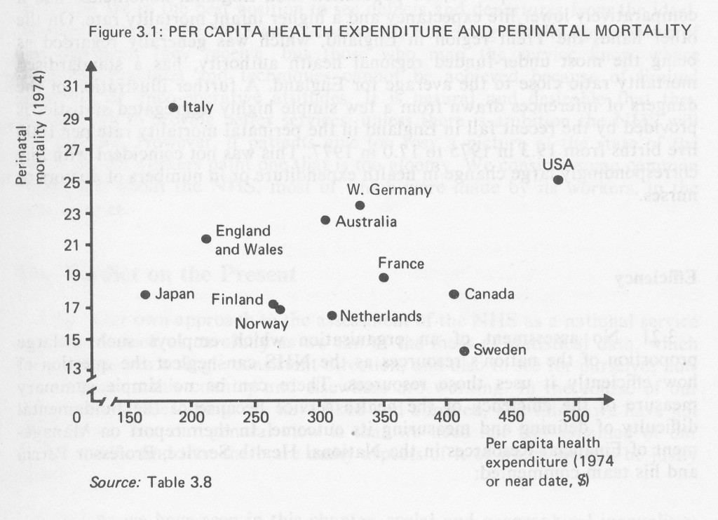
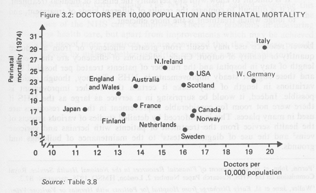
3.19 The UK was also performing relatively poorly in 1974 in terms of the three indicators of health – life expectancy and perinatal and maternal mortality – shown in Table 3.8. Figures 3.1 and 3.2, which plot two of the “input” measures (per capita health expenditure and doctors per 10,000 population) against one of the outcome measures (perinatal mortality) are illustrations of the difficulties in making international comparisons. Figure 3.1 shows that the general trend is for countries with a high per capita expenditure on health to have a relatively low perinatal mortality rate, although Japan and the USA diverge from this pattern. Figure 3.2 shows a more unexpected pattern; a high ratio of doctors to patients is associated with a relatively high perinatal mortality rate. A number of workers have examined this anomaly, but have found no convincing explanation, and it would be a mistake to accept either proposition at its face value. First, no single mortality statistic or group of statistics can summarise the health of a nation. Second, the scatter of points in the figures does not permit sweeping conclusions from such grossly simplified data. For example, Table 3.8 shows that in 1974 West Germany and the USA had much larger national incomes and per capita health expenditure than England and Wales but were performing worse in terms of perinatal and maternal mortality, and no better on life expectancy. On the other hand, Canada, Sweden and the Netherlands were all spending more per capita on health and had better life expectancy, perinatal and maternal mortality figures than the UK.
TABLE 3.8
Health Service Resources and Results: International Comparisons 1974 or Near Date1
| M | |||||||
| Per capita total expen diture on health | % | Doctors | Nurses | Life expectancy | Perinatal mortality | Maternal mortality | |
| Country | US$2 | Trend GDP3 | (per 10,000 1974) | (per 10,000 1974) | at age 1 M F | (per 1,000 live births) | (per 100,000 births) |
| Australia | 308 | 6.5 | 13.9 | 54.1 | 68.5 75.4 | 22.4 | 11.3 |
| Canada | 408 | 6.8 | 16.6 | 57.8 | 69.7 77.0 | 17.7 | 10.8 |
| Finland | 265 | 5.8 | 13.3 | 46.0 | 66.8 75.5 | 17.1 | 10.6 |
| France | 352 | 6.9 | 13.9 | 23.7 | 69.5 77.1 | 18.8 | 24.0 |
| Italy | 191 | 6.0 | 19.9 | 7.8 | 70.0 76.0 | 29.6 | 42.4 |
| Japan | 166 | 4.0 | 11.6 | 16.1 | 70.8 76.0 | 18.0 | 38.3 |
| Netherlands | 312 | 7.3 | 14.9 | 22.5 | 71.2 76.9 | 16.4 | 10.3 |
| Norway | 270 | 5.6 | 16.5 | 46.4 | 71.4 77.7 | 16.8 | 3.3 |
| Sweden | 416 | 7.3 | 16.2 | 58.6 | 72.0 77.4 | 14.1 | 2.7 |
| USA | 491 | 7.4 | 16.5 | 40.4 | 68.0 75.6 | 24.8 | 15.2 |
| W Germany | 336 | 6.7 | 19.4 | 27.6 | 68.6 74.9 | 23.2 | 45.9 |
| England and Wales | } | { | 13.1 | 33.7 | 69.5 75.6 | 21.3 | 13.0 |
| Scotland | 212 | 5.2 | 16.1 | 45.6 | 67.7 74.0 | 22.7 | 21.5 |
| N Ireland | } | { | 15.3 | 36.6 | 67.0 73.6 | 25.9 | 17.1 |
Sources: Organisation for Economic Co-operation and Development, Public Expenditure on Health, Paris, 1977, Table 1.
McKinsey & Co, International Comparisons of Health Needs and Health Services 1978.
Irving B Kravis, Alan W Heston and Robert Summers, “Real GDP per capita for more than one hundred countries”, Economic Journal, June 1978, Table 4.
Notes: ‘ There are a number of caveats concerning the figures in this table. Details are given in the sources listed.
2 The column is indicative rather than definitive: it has been derived by multiplying per cent of trend GDP spent on health care by actual GDP adjusted for purchasing power differences.
3 Trend GDP is used to avoid the influence of cyclical business fluctuations on the level of output, which could distort the measured share of health expenditure in that output. For details see OECD, Public Expenditure on Health, Paris, 1977, page 9.
3.20 Similar problems of interpretation are suggested by an examination of the distribution of NHS resources within the UK. Tables 3.2 and 3.3 showed that in 1977 Scotland, with 50% more hospital doctors and about 40% more nurses and midwives per 10,000 population than England, nonetheless had a comparatively lower life expectancy and a higher infant mortality rate. On the other hand, the Trent region in England, which was generally regarded as being the most under-funded regional health authority, has a standardised mortality ratio close to the average for England. A further illustration of the dangers of inferences drawn from a few simple highly aggregated statistics is provided by the recent fall in England in the perinatal mortality rate per 1000 live births from 19.3 in 1975 to 17.0 in 1977. This was not coincident with any correspondingly large change in health expenditure or in numbers of doctors or nurses.
Efficiency
3.21 No assessment of an organisation which employs such a large proportion of the nation’s resources as the NHS can neglect the question of how efficiently it uses those resources. There can be no simple summary measure of the efficiency of the health service because of the fundamental difficulty of defining and measuring its outcome. In their report on Management of Financial Resources in the National Health Service, Professor Perrin and his team commented:
“It is difficult to know with any certainty the effects of medical treatment, so it is difficult to compare the results of different kinds of treatment, and to judge which treatment is the more efficient.”
Lower resource use may result from greater efficiency or from a reduced quantity or quality of output. Crude indications of efficiency are the average length of stay in hospital and the number of patients treated per hospital bed, and these suggest steady improvements in NHS efficiency, though regional variations in length of stay make it certain that further improvement is possible. Indeed, it would be surprising in a service as large as the NHS if there were not room for considerable improvement in the way resources are used in many places. This is reinforced by detailed studies of various aspects of the health service from the treatment of patients with hernias and varicose veins and the use of diagnostic tests to the maintenance of buildings and grounds.
Health Workers’ Views
3.22 Health workers are critical of the NHS. They are involved with it daily and are in the best position to see defects and departures from the ideal. Most patients use the NHS only occasionally and are generally appreciative of the treatment they receive, but those who man the service know where improved practices and techniques cannot be achieved because of limited resources or unco-operative attitudes. It is natural and desirable that they should wish to provide better services: unless there is ambition the NHS will not improve. However, if patients give too rosy a picture of the state of the NHS, health workers paint one that is too gloomy. We consider some common complaints about the NHS, most of which were made by its workers, in the next chapter.
Our Verdict on the Present
3.23 Our own approach to the assessment of the NHS as a national service has been to look as carefully as we can at the mass of statistical data, which does not lead in a single consistent direction, and also to see for ourselves how the services in this country and elsewhere are working. In the course of our work we have seen things we have liked and admired, and things we have not liked at all. But our general view is that we need not feel ashamed of our health service and that there are many aspects of it of which we can be justly
3.24 As we have seen in this chapter, social and geographical inequalities in health and health care remain. The NHS by itself cannot overcome this problem, but it must remain a cause for concern, and an area in which the performance of the NHS can be improved. There are problems in measuring efficiency in health care, but apart from improvements which may be achieved through the use of more resources, we are convinced that the NHS can provide a better service by making better use of the resources now available to it.