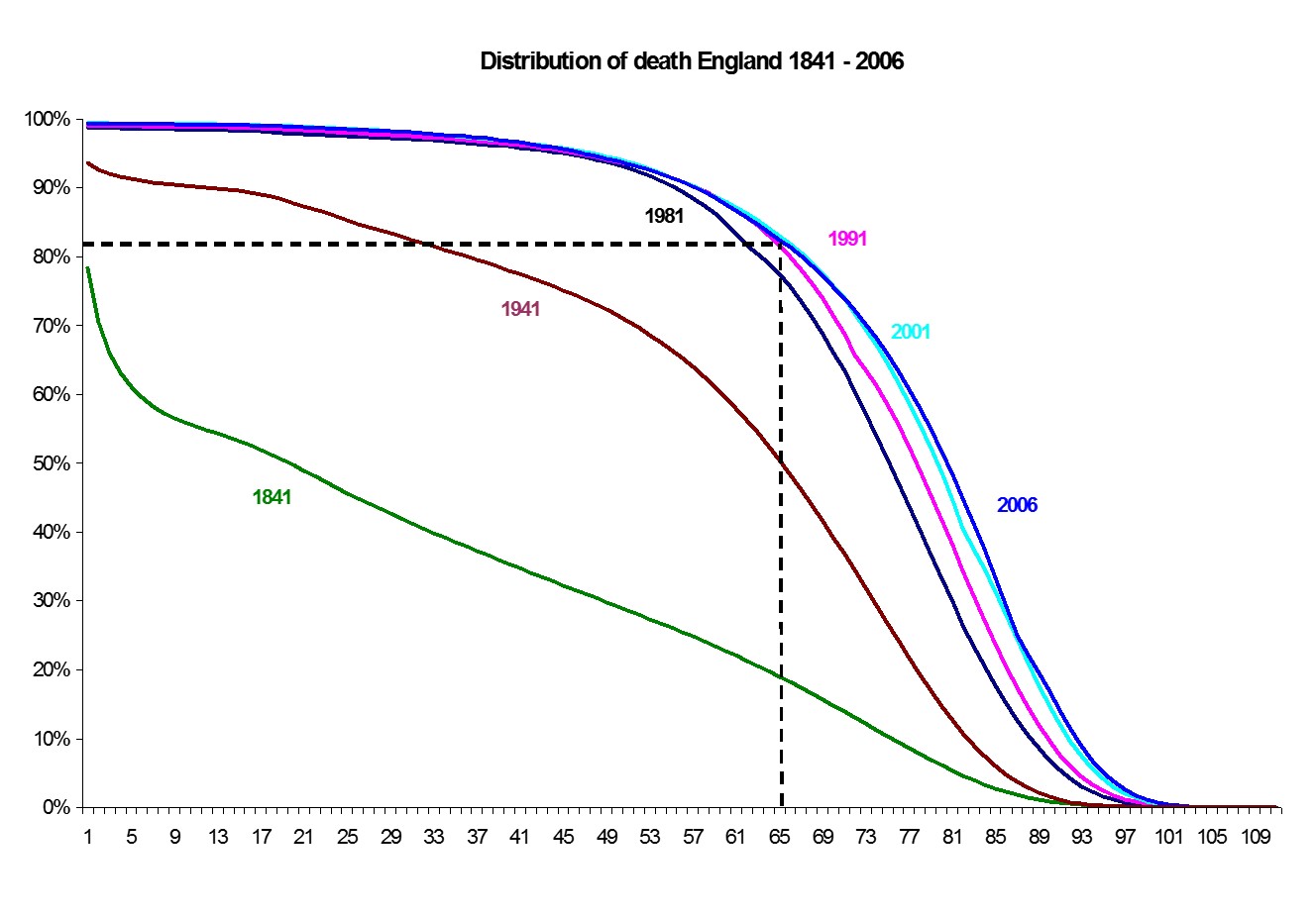
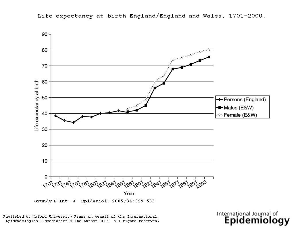
The Government’s proposals to increase the Retirement Pension Age have at last focused political attention on the increase in life expectancy which has been rising steadily since about 1860. It the UK it has been increasing by about five hours a day and there seems no reason to for the increases to stop any time soon unless there is radical government intervention.
Life expectancy, and healthy life expectancy varies across the UK (data from Health Expectancies at Birth and at Age 65 in the United Kingdom, 2008–2010)
| Life expectancy | Healthy life expectancy | Healthy life as proportion | ||||||||
|---|---|---|---|---|---|---|---|---|---|---|
| Men | ||||||||||
| United Kingdom | 78.0 | 63.5 | 81.4% | |||||||
| Great Britain | 78.1 | 63.9 | 81.8% | |||||||
| England | 78.4 | 64.4 | 82.1% | |||||||
| Wales | 77.5 | 63.0 | 81.3% | |||||||
| Scotland | 75.8 | 59.8 | 79.0% | |||||||
| Northern Ireland | 77.0 | 59.2 | 76.9% | |||||||
| Women | ||||||||||
| United Kingdom | 82.1 | 65.7 | 80.0% | |||||||
| Great Britain | 82.1 | 66.1 | 80.4% | |||||||
| England | 82.4 | 66.4 | 80.6% | |||||||
| Wales | 81.7 | 63.0 | 77.1% | |||||||
| Scotland | 80.3 | 64.1 | 79.7% | |||||||
| Northern Ireland | 81.4 | 61.9 | 76.0% |
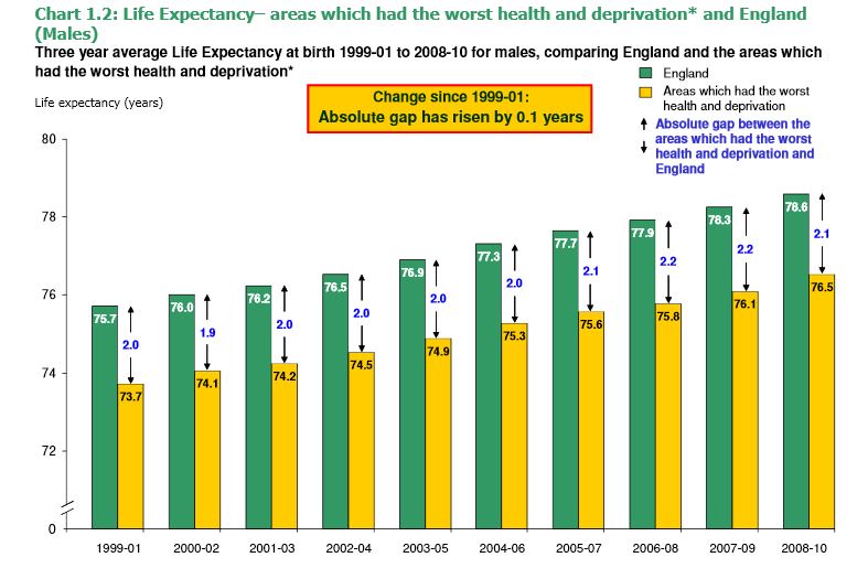
There is also considerable inequality between areas in England (data from the Department of Health Mortality Monitoring Bulletin)
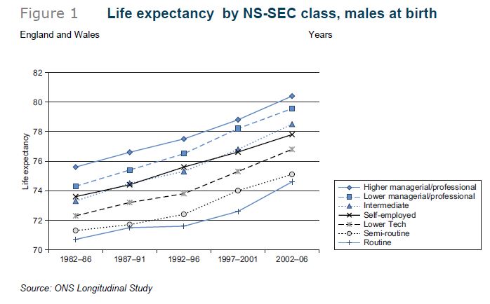
 When life expectancy is analysed “by the National Statistics Socio-economic Classification (NS-SEC)” (we don’t use the word “class” any more, and we don’t have much data about income) the picture is even clearer.
Most of the improvement in longevity is now among the old. Infant mortality is now so low that improvements there are slow and make little contribution to the overall picture. Economic inequality is however very significant in infant mortality. This graph of age at death does seem to suggest that there may be a biological limit to increasing life expectancy, but it’s about 100.