An assessment of the Public Health England report
Public Health England has launched a website which presents a collection of information on premature mortality among 150 English local authorities (Public Health England, 2013). The information is provided with the aim of giving local authorities an insight into the leading causes of avoidable early death. However the website displays serious shortcomings and is inadequate as a basis of decision making for resource allocation or political action. The data presented in the Public Health England report are, for each local authority in England, the total death rate under the age of 75 and also rates grouped by four major causes – cancer, heart disease and stroke, lung disease and liver disease.
The Longer Lives website provides some background to the data. It states “The indicators in Longer Lives use records of deaths provided for each year by the Office of [sic] National Statistics. The disease considered to be the underlying cause of each death is recorded using the International Classification of Diseases”. (Why is the Office for National Statistics named incorrectly?)
Where the data comes from
The causes of death which are listed on a death certificate are not objective measures but are the interpretation by a clinician based on the information available (Bingham, 2012). From April 2014 independent medical examiners will certify all deaths in England other than those requiring a coroner’s investigation (Department of Health, 2011). As a pilot of the change in procedure for classifying causes of death there was a study of 548 deaths between November 2010 and January 2011 in four areas of England (Vickers et al, 2011). The cause of death given on each of the 548 death certificates was compared with a medical examiner’s assessment of the cause of death. For 406 out of 548 the original certifier and the medical examiner gave the same cause of death. However, the original certifier found 144 deaths caused by cancer while the medical examiner decided there were 150, an increase of 4%. While the certifier found 128 deaths from circulatory disease the medical examiner found 137, an increase of 7%. Both these groups of conditions are in the Longer Lives list of premature deaths. The figures Public Health England is using are therefore not totally reliable, and are subject to an unknown level of variation.
When analysing data a confidence interval gives an indication of the level of uncertainty around an estimate of eg a mortality rate. The data presented in Longer Lives relate to the years 2009-11. The Longer Lives website includes a link to a spreadsheet listing the overall rate of premature mortality for each local authority. The spreadsheet includes confidence intervals, but these are not mentioned on the web pages. Regrettably there is no data on the four specific causes of death mapped in the report.
Mortality rates at the local authority level vary over time, sometimes by a wide margin. Generally speaking the smaller the population of an area the wider can be the fluctuation in mortality rates over time. One death in an area like Bury with a population of around 185,000 has a greater influence on its mortality rate than one death in Lancashire, with a population of around 1,172,000. Nowhere on the website is there a mention of confidence intervals, or trends over time in mortality rates. Without considering trend data it is not possible to judge if the mortality rates in an area are increasing or decreasing. This is a major omission and highlights a lack of rigour in the study.
What the colour key indicates
The website states that “The maps and local authority data pages use a red, orange, yellow and green colour key to indicate how the individual premature mortality rates in local authorities compare.” Public Health England uses league tables to compare and classify local authorities. League tables are a very misleading means of comparing performance. Statisticians advise that because league tables have shortcomings as a means of presenting data on comparative performance their use should be accompanied by a warning about the need to be cautious in drawing conclusions from a set of rankings (eg Goldstein and Spiegelhalter, 1996).
A more informative and intuitively appealing method of presenting comparative data is the funnel plot. Figure 1 below shows the under 75 directly standardised mortality rate for males during 2008-10 in English local authorities, presented as a funnel plot. The highest dot on the map is Manchester, showing how much higher the Manchester male mortality rate is than anywhere else in England. A league table does not give the message as effectively.
Figure 1
Funnel plot of under 75 male all causes mortality in local authorities in England 2008-10
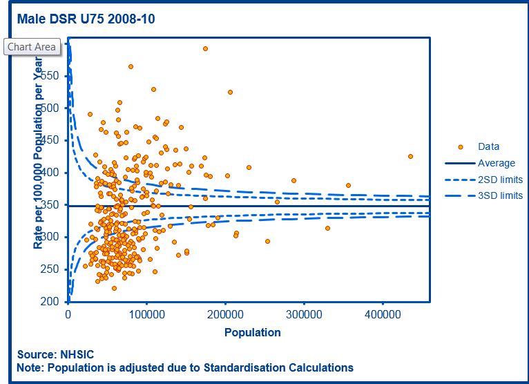
Source ; NHS Information Portal https://indicators.ic.nhs.uk/webview/D
Male and female mortality rates differ across areas. It is an unexplained omission by PHE that male and female mortality rates are not presented separately on the website. Figure 2 below shows the under 75 directly standardised mortality rate for females during 2008-10 in English local authorities. Once again the highest dot on the map is Manchester. It is striking, though, that female mortality rates are considerably lower than male. Presenting male and female rates combined into a single figure is not helpful to decision-makers.
Figure 2
Funnel plot of under 75 female all causes mortality in local authorities in England 2008-10
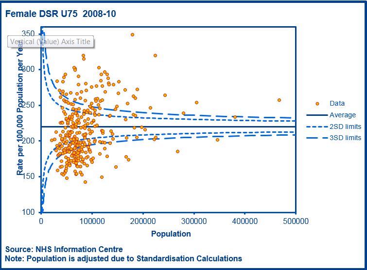
Source ; NHS Information Portal https://indicators.ic.nhs.uk/webview/
Figure 3 is a funnel plot of the data provided on the Public Health England website. The graph is a more effective means than a league table of showing the data. The two dots at the top of the chart represent Blackpool and Manchester.
Figure 3
Premature mortality – All persons aged under 75 – Local authorities in England – 2009-11
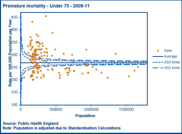
Source:http://longerlives.phe.org.uk/
Public Health England is using the Indices of Multiple Deprivation as a measure of the socio-economic status of an area (DCLG, 2011). The PHE says that their classification of socio-economic deprivation divides “local authorities into five groups according to their index of multiple deprivation – an estimate of local affluence or poverty” (PHE, 2013). The Indices are a set of data produced by a series of complex calculations. As the DCLG description of the Indices declares “It is important to note that these statistics are a measure of deprivation, not affluence, and to recognise that not every person in a highly deprived area will themselves be deprived.” They are NOT therefore a measure of socio-economic status. To use them for this purpose is to misinterpret the data.
Most of the data in the 2010 Indices have been calculated from actual or modelled information relating to 2008, the year the economic downturn began. Since then the socio-economic characteristics and health outcomes of the population have changed. Local authorities are therefore being classified by their situation in 2008 but judged by their performance in 2009-11.
There is some double-counting in using the Indices of Deprivation to account for mortality. Within the Indices are a group of variables relating to illness and mortality. The mortality indicator measures premature mortality during 2004-08. It would be surprising if mortality during 2004-08 did not show some relationship with mortality during 2009-11.
Conclusion
The Longer Lives website is a curiosity. One of its pages presents a list of local authorities grouped by their score on the Index of Multiple Deprivation and ranked by their under 75 directly standardised mortality rate. The website states, correctly, that “generally, more deprived areas have worse premature mortality.” There is, however, no evidence cited to suggest that deprivation causes premature mortality or that by reducing the level of deprivation in an area its mortality rate will improve. Without establishing that link it is not clear why local authorities with a similar level of deprivation should have similar mortality rates.
It is regrettable that the Indices of Multiple Deprivation are used as a proxy for measures of poverty and affluence. The Indices were not designed to measure affluence, and a more robust index of socio-economic status could be employed to investigate explore the relationship between deprivation and premature mortality.
As human beings we are all at risk of heart disease, cancer and all the other conditions listed in the International Classification of Diseases. The difference across the population is that the level of risk of developing any of these conditions varies substantially. While an individual’s income and wealth may modify their risk of becoming ill, deprivation in itself will not cause the illness, and reducing an individual’s level of deprivation will not necessarily prevent illness.
Among the many causes of premature mortality are an individual’s genetic inheritance, their environment eg air pollution and standard of housing, and socio-economic characteristics like income and occupation. In any individual the causal chain of an illness begins at the molecular and cellular level before over time becoming identifiable as signs and symptoms of morbidity. Deprivation can be one link in that chain but is not in itself the cause of premature mortality.
The Longer Lives website appears to be suggesting, although it does not say so, that cancer, heart disease, lung disease and liver disease are associated with aspects of deprivation. The causes of many of the cancers which result in premature mortality are far from clear. For some cancers eg brain tumours and lymphomas, the causes are yet to be identified but probably have no connection with deprivation. Others eg breast and skin cancer, show a negative relationship with deprivation (Shack et al, 2008).
Individually local authorities can have limited success in reducing heart disease. As Capewell and O’Flaherty note “Over 80% of cases of premature cardiovascular disease can be prevented through population-wide control of tobacco and governmental policies that promote a healthy diet” (Capewell and O’Flaherty, 2009). Capewell and Graham add that “there is evidence that CVD prevention strategies for screening and treating high-risk individuals may represent a relatively ineffective approach that typically widens social inequalities. In contrast, policy interventions to limit risk factor exposure across populations appear cheaper and more effective; they could also contribute to levelling health across socioeconomic groups” (Capewell and Graham, 2010).
Air pollution is known to be associated with diseases of the heart and lungs. A recent study found that air pollution in London causes 4267 deaths annually. Air pollution accounted for 9% of deaths in the City of London, and 8.3% in each of Westminster and Kensington and Chelsea boroughs (Air Quality News, 2012). These are not the most deprived areas of London.
The canned and processed food sold in shops and supermarkets contains excessive amounts of salt and sugar. Although these are necessary for life, taken in excess they are associated with cardiovascular conditions. If manufacturers added less salt and sugar to those products there would in time be a measurable reduction in premature mortality.
Alcohol consumption varies by social class. The Health Survey for England has found that “People living in higher income households, and those in the least deprived areas, were the most likely to drink above the threshold for risk of harm” (Craig and Mindell, 2012). Another study found that “While deprivation may explain a large proportion of the variability in mortality for alcohol-related liver disease, it does not account for all local authority level variation for other liver diseases” (Beynon and Hungerford, 2012).
There are two ways in which the Longer Lives website could support local authorities in their aim of reducing premature mortality. Public Health England could provide a critical assessment of the evidence for the known and suspected causes of premature mortality. Local authorities could use this evidence to build robust strategies to improve life expectancy. Kate Pickett and Richard Wilkinson state in ‘The Spirit Level’ that “inequality has a damaging effect on health” (Pickett and Wilkinson, 2010). Furthermore “reducing inequality in the OECD countries alone would prevent upwards of 1.5 million deaths per year.” Public Health England could discuss the extent to which inequality within and between local authorities is associated with premature mortality.
Secondly Public Health England could model the effect in terms of deaths prevented of modifying the levels of risk factors for premature mortality. Examples that lend themselves to modelling are the reduction of the average amount of salt consumed per person and an improvement in air quality. Reducing salt intake would reduce cardiovascular disease. Improving air quality would reduce a wide range of illnesses. Quantitative models of this type would provide evidence for local authority initiatives to improve health.
In conclusion although the Longer Lives website presents valuable data, there is a gap in the evidence for the thinking which led to the choice of data and its method of presentation. Public Health England could provide a further service to local authorities by making explicit that evidence.
This article has been revised and expanded from the original version.
References
Air Quality News 2012 December 10 Air pollution responsible for 4,000 London deaths a year
Association of Public Health Observatories: Analytical Tools for Public Health: Funnel plot for rates (including directly standardised rates)
Beynon, C and Hungertford, D 2012 Burden of Liver Disease and Inequalities in the North West of England NHS North West
Bingham J 2012 One in four deaths ‘not properly recorded‘ The Telegraph
Capewell, S and Graham, H 2010 Will Cardiovascular Disease Prevention Widen Health Inequalities? PLoS Medicine August 2010 Vol 7 Num 8
Capewell, S and O’Flaherty, M 2009 Trends in cardiovascular disease: Are we winning the war? Canadian Medical Association Journal June 23, 2009 vol. 180 no. 13
Craig R, Mindell J (eds) (2012) Health Survey for England 2011, London: The Information Centre
http://www.hscic.gov.uk/catalogue/PUB09300
Department for Communities and Local Government,2011 English indices of deprivation 2010
Department of Health 2011 Death certification reforms: New duty on local authorities
Goldstein, H and Spiegelhalter, D 1996 League Tables and Their Limitations: Statistical Issues in Comparisons of Institutional Performance Journal of the Royal Statistical Society. Series A (Statistics in Society), Vol. 159, No. 3. (1996), pp. 385-443.
Public Health England, 2013 Longer lives
Shack L et al 2008 Variations in incidence of breast, lung and cervical cancer and malignant melanoma of skin by socio-economic group in England BMC Cancer 2008 8.271
Spiegelhalter, D 2002 Qual Saf Health Care 2002;11:390–392 Funnel plots for institutional comparison
Vickers L et al Death certification Potential impact on mortality statistics ONS 2011