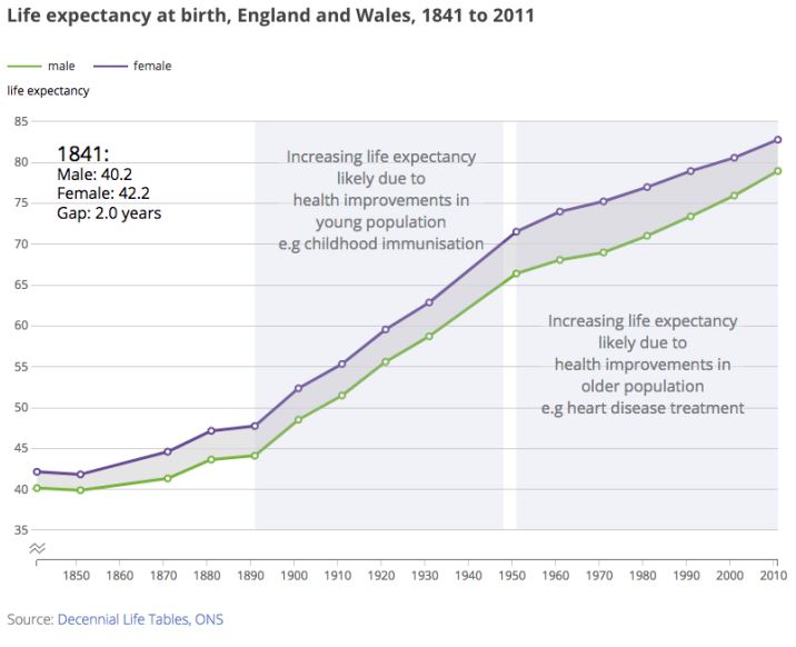
The first English Life Table was based on data collected around the census year of 1841 and gave female life expectancy as 42 and male as 40.[1] By the sixth table, in 1891, life expectancy for women in England and Wales was 48 and for men 44. Many people lived longer than this, but so many babies died in their first year of life that it brought the average down. Public health reforms during the 1890s meant that by 1901 life expectancy was 52 for women and 48 for men.[2] Four years each, gained in just ten years. The turn of the century brought a dramatic drop in infant and childhood mortality as sanitation and living standards improved. By 1921 women were expected to live to 60 and men to 56. Eight years each, gained in just twenty years. By 1951 women’s life expectancy was 72 and men’s 66. Women gained 12 years to men’s ten over this thirty-year period as a result of better maternity care, partly due to the new NHS, and a higher proportion of women being non-smokers. This rise, of more than a year every three years, took place despite war, rationing and austerity.
Improvements slowed in the 1950s. Most of the easy victories had been achieved. In 1956 the Clean Air Act was passed, four years after the Great Smog caused excess deaths that Harold Macmillan tried to blame on influenza.[3] By 1971 life expectancy for women was 75 and for men 69. Three years more each, achieved in twenty years. In the 1970s the rate of improvement in life expectancy accelerated again. Social progress in that much maligned decade meant that despite cutbacks in healthcare and public services in the 1980s under Margaret Thatcher, by 1991 women were living to 79 and men to 73. Four years each, achieved in twenty years.
Over the next twenty years, men caught up a little with women: since more men smoked there were more male smokers who could give up. By 2011 women were expected to live to 83 and men to 79. In those twenty years women gained three years and men five. The six-year gap that had opened up by 1951 was back to four.
Since 2011, under David Cameron and Theresa May, life expectancy has flatlined. The latest figures, published by the Office for National Statistics in September, are for the period 2014-16. Women can now expect to live for 83.06 years and men for 79.40 years.[4] For the first time in well over a century the health of people in England and Wales as measured by the most basic feature – life – has stopped improving. Just as Macmillan had done, the government initially tried to blame the figures on flu deaths. But as the years have passed and life expectancy continues to stall it has become clear that flu isn’t the culprit. The most plausible explanation would blame the politics of austerity, which has had an excessive impact on the poor and the elderly[5]; the withdrawal of care support to half a million elderly people that had taken place by 2013; the effect of a million fewer social care visits being carried out every year; the cuts to NHS budgets and its reorganisation as a result of the 2012 Health and Social Care Act; increased rates of bankruptcy and general decline in the quality of care homes; the rise in fuel poverty among the old; cuts to or removal of disability benefits. The stalling of life expectancy was the result of political choice.
The first to be affected were elderly women living alone in the poorest parts of the UK. Their areas had been targeted by the last Labour government for interventions aimed at improving health. All those schemes were cancelled in the years after 2010. By 2016 cuts in welfare spending, especially those affecting older pensioners, had been linked to a rise in deaths. Public health experts writing in the British Medical Journal called for an inquiry, but the government refused.[6] Instead officials continued to claim that ‘recent high death rates in older people are not exceptional.’[7] An even higher rise in the death rate was recorded for Scotland, but again there was no serious response.[8] By July 2017 Michael Marmot’s Institute of Health Equity was linking NHS cuts to the rise in deaths among those with dementia and to faltering life expectancy.[9] A paper I co-wrote with researchers at Liverpool, Glasgow and York connected the rise in mortality rates with delays in discharging elderly patients from hospital because appropriate social care was not available.[10] The Financial Times reported that the slowdown in life expectancy had cut £310 billion from British pension fund liabilities, and these figures included only a few pension schemes.[11]
Life expectancy for women in the UK is now lower than in Austria, Belgium, Cyprus, Finland, France, Germany, Greece, Iceland, Ireland, Italy, Liechtenstein, Luxembourg, Malta, the Netherlands, Norway, Portugal, Spain, Sweden, and Switzerland.[12] Men do little better.[13] In almost every other affluent country, apart from the US, people live longer than in the UK, often several years longer and the best countries are pulling away. Between 2011 and 2015 life expectancy rose by a year in both Norway and Finland.[14] It rose by more than a year in Japan, despite the Japanese already having the highest life expectancy in the world.[15]
Extra deaths now projected to occur every year in the UK from 2016 to 2058, by ONS – 2016-based projection as compared to the 2014-based projection
Extra Cumulative Time Period
‘in year’
deaths
39,307 39,307 2016 – 2017
25,668 64,975 2017 – 2018
27,246 92,221 2018 – 2019
28,521 120,742 2019 – 2020
29,581 150,323 2020 – 2021
307,031 457,354 2021-2030
246,302 703,656 2031-2040
178,483 882,139 2041-2050
17,310 882,139 2050 – 2051
17,463 899,602 2051 – 2052
17,582 917,184 2052 – 2053
17,650 934,834 2053 – 2054
17,600 952,434 2054 – 2055
17,404 969,838 2055 – 2056
17,050 986,888 2056 – 2057
16,524 1,003,412 2057 – 2058
Source – calculated directly from ONS tables of expected deaths by age and year.[16]
In the UK official projections have now been altered because of the tens of thousands of people who have died earlier than expected. If you subtract the latest ONS figures from the figures published two years ago, you can see that a further one million earlier deaths are now projected in the next forty years (the ONS itself doesn’t publish this number – it is shown in the table above).[17] What has happened is no longer being treated as a decline; it is the new norm. On 26 October the Office for National Statistics announced that it estimates that, by 2041, life expectancy for women will be 86.2 years and for men 83.4. Both figures are almost a whole year lower than projected in 2014.[18]
Superficially this might appear a small adjustment that will only have an effect many years in the future. But its implications are huge.[19] Already in the year from July 2016 to June 2017 an additional 39,307 people have died. Seven per cent of them were people between 20 and 60: almost 2000 men and 1000 women. Well over four-fifths of the premature deaths projected by the ONS will be of people who are now in their forties and fifties.
These extra deaths are not linked to more migration to the UK: the ONS now projects less in-migration. They are not due to a rise in births: the ONS now projects lower birthrates. They are simply the result of mortality rates having risen in recent years.[20] The ONS believes this will have a serious effect on life expectancy and population numbers for decades to come. It does not say why the change has happened or even point out how exceptional it is.
The UK government accepts that air pollution, a reversible cause, results in 40,000 premature deaths a year.[21] There are complaints and headlines about that, but not about the fact that there were almost 40,000 more deaths than expected in the year up until June 2017. It is projected that there will be an extra 25,000 deaths between July 2017 and June 2018; an extra 27,000 in the year after that, more than 28,000 extra deaths in the 12 months after that, then another 30,000 (see table above). And on and on and on, and still the government has given no explanation.
Whatever has happened has happened in a country where the official statisticians feel they can only point out in the seventh note[22] attached to a press release that some figures have been adjusted. It is not difficult to guess the likely cause of the sudden deterioration in the health of the nation. If we do not address the policies that have caused these changes, the ONS projections will become reality.[23]
References
[1] ONS (2015) How has life expectancy changed over time? London: ONS, September 9th, https://visual.ons.gov.uk/how-has-life-expectancy-changed-over-time/
[2] Dorling, D. (2006) Infant Mortality and Social Progress in Britain, 1905-2005
In: Eilidh Garrett, Chris Galley, Nicola Shelton and Robert Woods (eds), Infant Mortality: A Continuing Social Problem: A volume to mark the centenary of the 1906 publication of Infant Mortality: A Social Problem by George Newman. pp 223-228, available here: http://www.dannydorling.org/?page_id=2442
[3] Dorling, D. (2014) Why are the old dying before their time? How austerity has affected mortality rates, New Statesman, February 7th, https://www.newstatesman.com/politics/2014/02/why-are-old-people-britain-dying-their-time
[4] ONS (2017) National life tables: England and Wales 2014-2016 released on September 27th 2017: https://www.ons.gov.uk/peoplepopulationandcommunity/birthsdeathsandmarriages/lifeexpectancies/datasets/nationallifetablesenglandandwalesreferencetables
[5] Loopstra R, McKee M, Katikireddi SV, Taylor-Robinson, D, Barr B and Stuckler D. (2016) Austerity and old-age mortality in England: a longitudinal cross local area analysis, 2007–2013. J R Soc Med;109: 109–116.
[6] Hawkes N. (2016) Sharp spike in deaths in England and Wales needs investigating, says public health expert, BMJ; 352: i981.
[7] Hawkes N. (2013) Recent high death rates in older people are not exceptional, says Public Health England. BMJ 2013; 347: f5252.
[8] Dorling, D. (2016) The Scottish Mortality Crisis, The Geographer (Newsletter of the Royal Scottish Geographical Society), Summer, pp.8-9, http://www.dannydorling.org/wp-content/files/dannydorling_publication_id5595.pdf
[9] Marmot, M. (2017) Marmot Indicators Briefing, Embargo: 0001hrs Tuesday 18th July, London: Institute of Health Equity, http://www.instituteofhealthequity.org/resources-reports/marmot-indicators-2017-institute-of-health-equity-briefing/marmot-indicators-briefing-2017-updated.pdf
[10] Green, M.A., Dorling, D., Minton, J., and Pickett, K.E. (2017) Could the rise in mortality rates since 2015 be explained by changes in the number of delayed discharges of NHS patients? Journal of Epidemiology & Community Health, Online First: 2nd October 2017 doi: 10.1136/jech-2017-209403
[11] Combo J. Life expectancy shift ‘could cut pension deficits by £310bn’, The Financial Times, 2017 [updated 4 May 2017; cited 2017 8 August]. Available from: https://www.ft.com/content/77fa62fe-2feb-11e7-9555-23ef563ecf9a.
[12] Eurostat (2017) File: Life expectancy at birth, 1980-2015 (years), Brussels: Eurostat, http://ec.europa.eu/eurostat/statistics-explained/index.php/File:Life_expectancy_at_birth,1980-2015(years).png
[13] Ibid.
[14] Ibid.
[15] Otake, T. (2017) Continuing streak, Japan leads world in life expectancy, WHO report says, The Japan Times, May 17th, https://www.japantimes.co.jp/news/2017/05/17/national/science-health/continuing-streak-japan-leads-world-life-expectancy-report-says
[16] ONS (2017) National Population Projections: 2016-based statistical bulletin, London:ONS, Oct. 26th, https://www.ons.gov.uk/peoplepopulationandcommunity/populationandmigration/populationprojections/bulletins/nationalpopulationprojections/2016basedstatisticalbulletin
[17] To calculate these figures yourself you need to download the principal variant projections of 2014 and 2016 based by single year of age from here: https://www.ons.gov.uk/peoplepopulationandcommunity/populationandmigration/populationprojections/datasets/z1zippedpopulationprojectionsdatafilesuk
[18] ONS (2017) National Population Projections: 2016-based statistical bulletin, London: ONS, October 26th,https://www.ons.gov.uk/peoplepopulationandcommunity/populationandmigration/populationprojections/bulletins/nationalpopulationprojections/2016basedstatisticalbulletin#changes-since-the-2014-based-projections
[19] For the UK, at is makes up just under 1% of the global population, the implications are on the same order of magnitude as Sen’s findings of 1990 for the world but about the future, not the past: Sen, A. (1990) More Than 100 Million Women Are Missing, New York: The New York Review of books, December 20th, http://www.nybooks.com/articles/1990/12/20/more-than-100-million-women-are-missing/
[20] Dorling, D. (2016) Public Health was declining rapidly before the Brexit vote Public Sector Focus, July/August, pp.20-22, http://www.dannydorling.org/?page_id=5639
[21] Roberts, M. (2016) UK air pollution ‘linked to 40,000 early deaths a year’, BBC News (Health) February 23rd, http://www.bbc.co.uk/news/health-35629034
[22] ONS (2017) Note ‘7. Changes since the 2014-based projections’, London: ONS, https://www.ons.gov.uk/peoplepopulationandcommunity/populationandmigration/populationprojections/bulletins/nationalpopulationprojections/2016basedstatisticalbulletin#changes-since-the-2014-based-projections
[23] There are numerous examples of where projections have not held true in future because people react to the projections and ten improve things before all the harm projected to occur if we can on as usual, can occur. See: Dorling, D. and Gietel-Basten, S. (2018) Why Demography Matters, preliminary details are here: http://www.dannydorling.org/books/demography/
First published by the London Review of Books